Pepsi Global Redesign
As one of the biggest, most recognised, and most valuable brands in the world, Pepsi has an almost unparalleled history. For 125 years, Pepsi has not only reflected culture, it has been fundamental in shaping culture around the world. Nowhere is this seen more evidently than in how the visual identity has evolved and been applied over many, many decades.
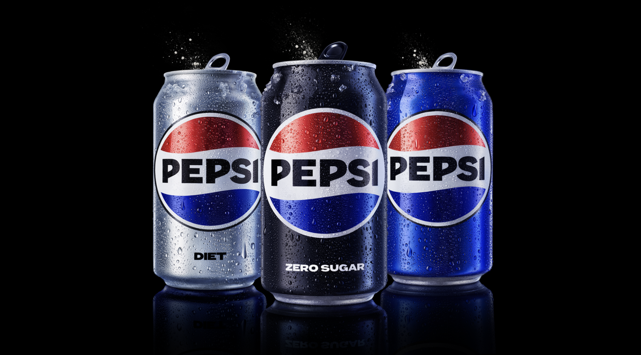
The last time the Pepsi identity received a major overhaul was in 2009. A decade or so later, many felt this identity looked tired and so, in late 2021, the PepsiCo Design team in New York began exploring new directions for the visual identity.
Through intensive design exploration and rigorous consumer inputs, the team created a new logo that referenced the past in order to propel the brand forward. They updated Pepsi’s core blue to be more vibrant and digital-first, and created a series of new visual elements like the Pepsi Pulse to reinforce meaning around the brand being the energetic and beating heart of culture.
Leveraging a globally distributed and culturally diverse design task force, my team led the internationalisation the new identity, adapting it for use across 140+ markets. Working across thousands of SKUs and packaging formats, multiple flavours, language variants, and possible in-market applications, we were able to expand the visual architecture of the core brand allowing it to be executed with the highest degree of consistency, whilst making it adaptable and relevant for local markets.


Design by PepsiCo Design & Innovation.